Project
Cloud Kitchen is a website and mobile application that allows users to join groups and share recipes with each other.
My Role
UI/UX Designer
Built In
Adobe XD
Project Time
4 Weeks
Responsibilities
Competitive Analysis, User Research, UI Design, Usability Studies, UX Design, Sitemap
Define
The Problem
How can we find a way to help users find recipes that fit their needs?
The Goal
Design a website and mobile app that allows users to locate specific recipes based on ethnic, fiscal, and visual themes.
Background
Some recipe websites can feel more like a randomized recipe book rather than an organized resource. Users want a way to locate recipes that fit various themes and have a voice in what they think of those recipes. By building a community based recipe site, users can have an efficient and effective way to find the perfect recipe every time.
Research & empathize
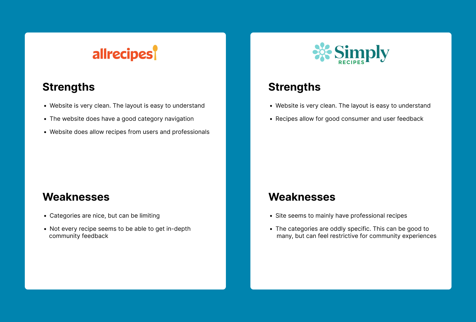
Competitive Analysis
Two websites showed up that seemed to have similar goals. Users had stated that they had used these websites at least once. Websites were logged into and pulled recipes to see what the general user experience felt like to highlight some best practices.
User Research
User research was conducted on individuals that have reported that they actively cook meals at home at least once a week. Before designing the application, users were asked about their current recipe experiences and if there were any features that they currently liked or wished for. Users were given unmoderated usability studies that directed them on how to navigate the site prototype. Users were then given a form to answer questions on different pain points and features that they noticed.
User Insights
• Users wanted a way to find recipes fast. Speed in getting to a recipe was the king factor.
• The other insight was unintuitive when matched with the first insight. Users stated that they did not always know what they wanted in a recipe. Their frustration was that they wanted a better way to figure out what food sounded good to them, but they also wanted this at a reasonably quick speed.
User journey
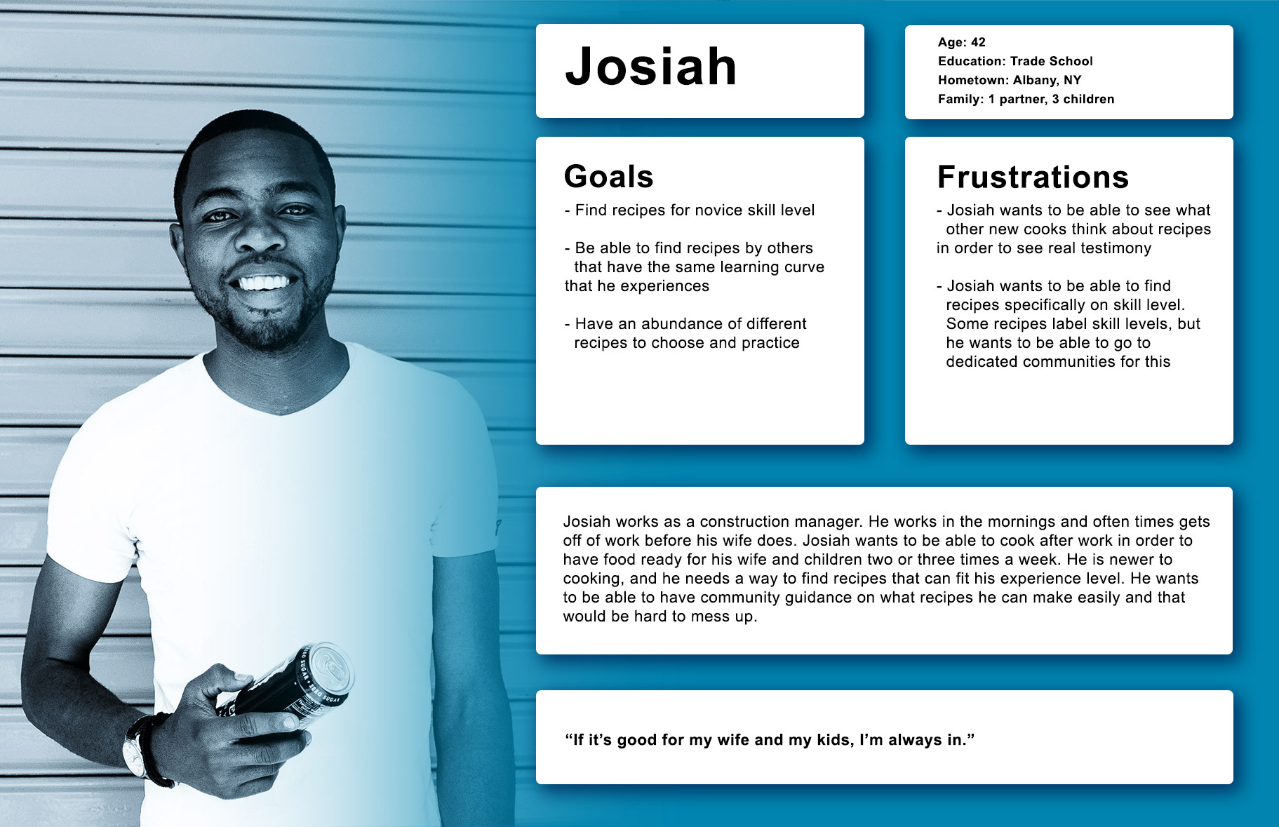
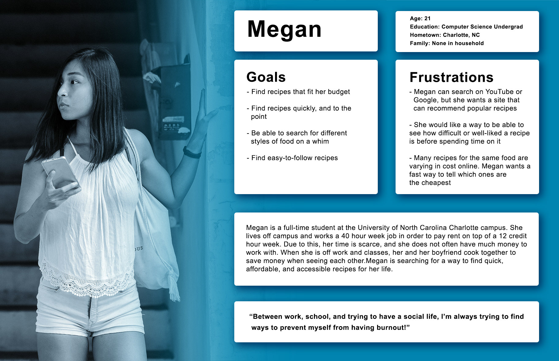
Personas
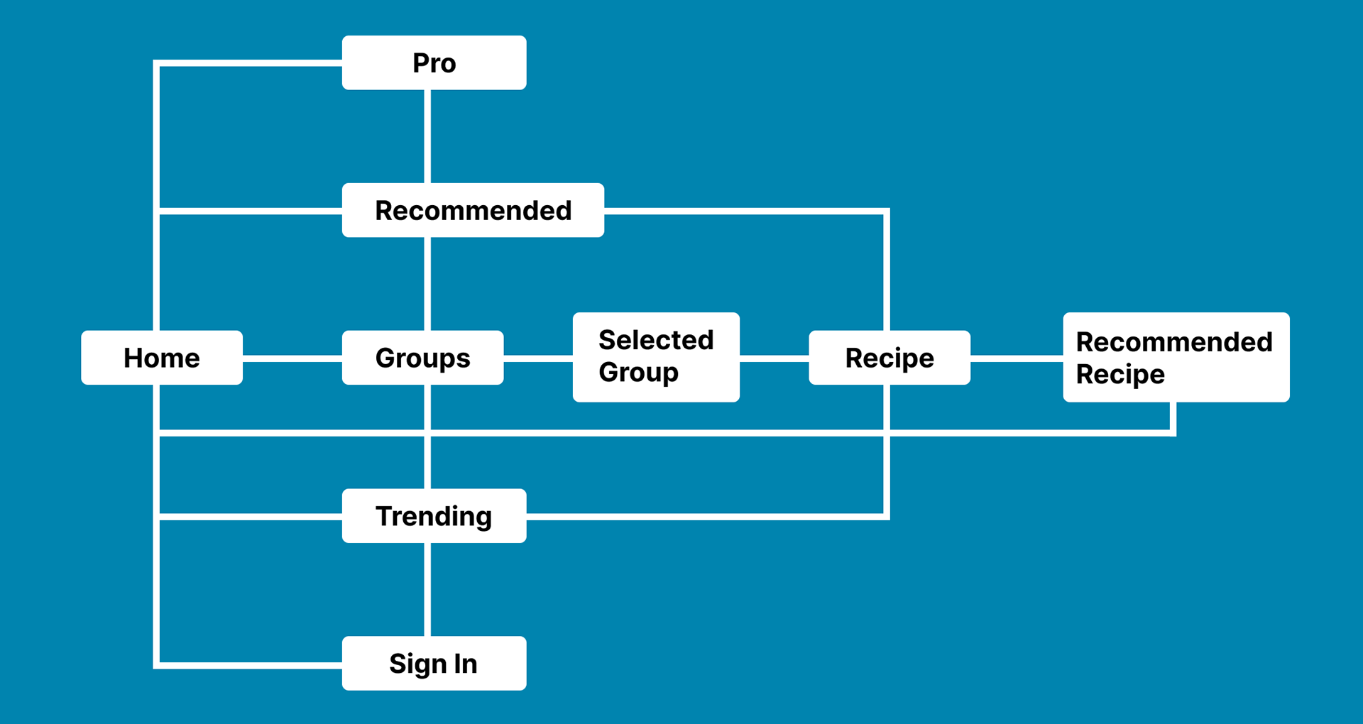
User Flow Grid
The user flow grid was designed to layout how each tab connected to each other and what user flow loops would be implemented in the design. Pages all took into account being able to move to other areas in the site and to get from one point to another in minimal steps.
DESIGN
Paper Wireframes
Wireframes started on paper. Notes were made next to some of the page designs in order to help explain and justify some of the philosophy in design choice.

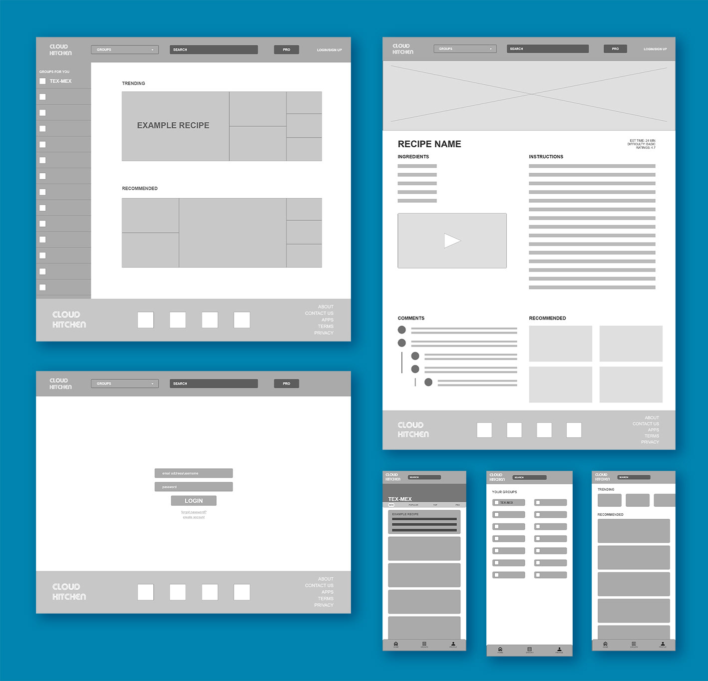
Low Fidelity Design & Prototyping
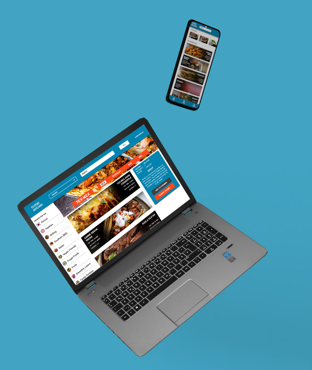
Low fidelity designs for the desktop site and mobile app were drafted at the same time. Due to the nature of the application using a lot of algorithm-based content, two very different layouts were needed between the desktop and mobile designs. The desktop site leaned a lot harder into horizontal screen real estate, but pages like the home page made it evident that the mobile app would need to change to a different card based home page and dedicated vertical page for the groups function.
High Fidelity Design & Prototyping
High fidelity design brought the envisioned concepts from the wireframes and low fidelity mockups to life. Once these pages were created, usability studies were sent out to participants to determine needed changes.


High Fidelity Usability Study & Changes
Users were given prototypes of the desktop and web applications and instructed on recipe lookup via accessing groups. Changes were made to final designs based on user feedback.
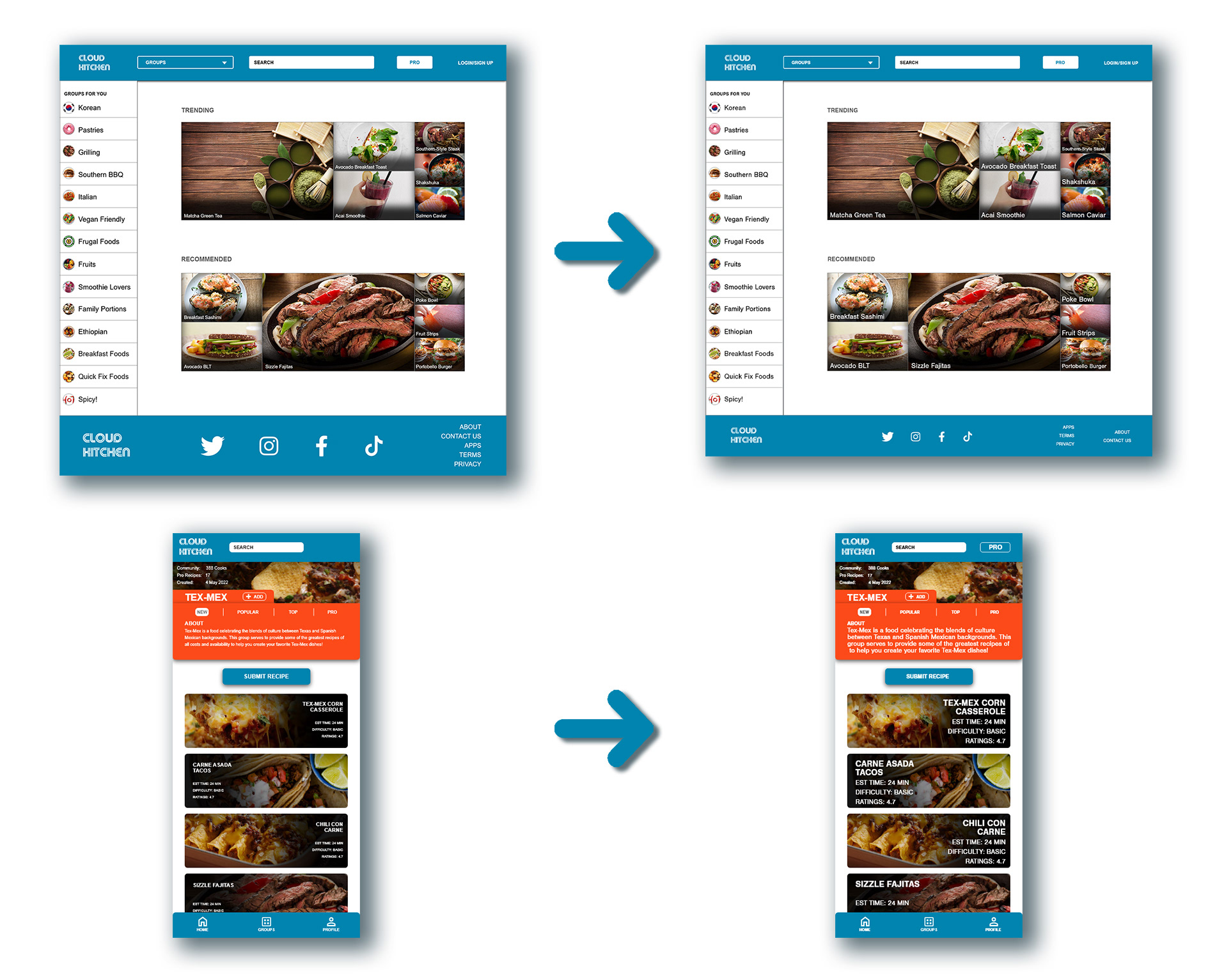
1. The footer needed to be slimmed down. Users felt that the footer took up too much screen real estate.
2. In the mobile app, users noted that text was difficult to read due to size. Fonts were increased in order to help improve readability.
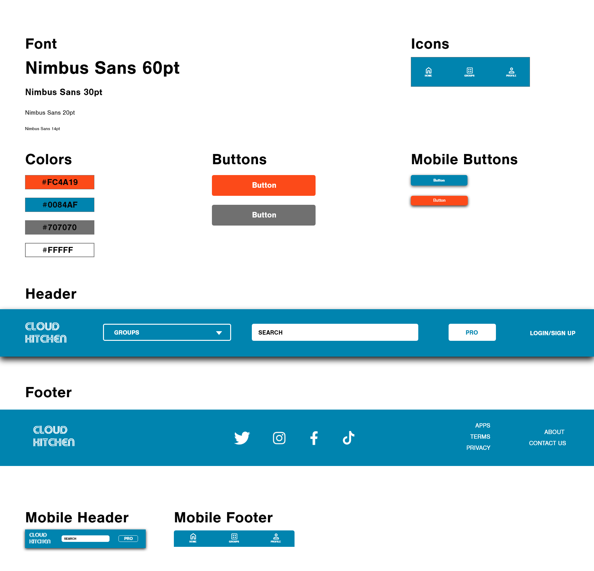
Style Guide
The style guide was put together in order to keep consistent colors and fonts. Complete with copy and paste capable icons, UI components, and color codes.
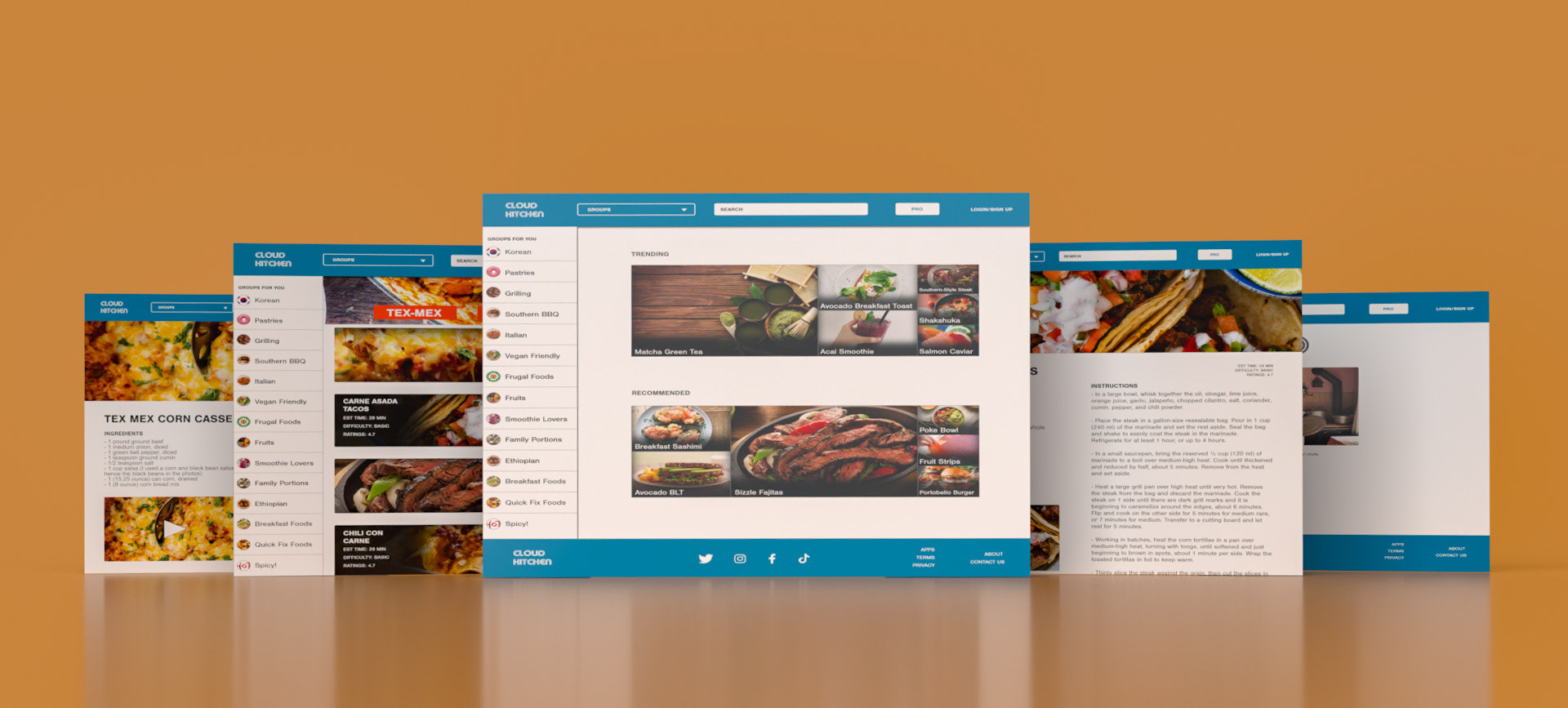
Final High Fidelity Screens

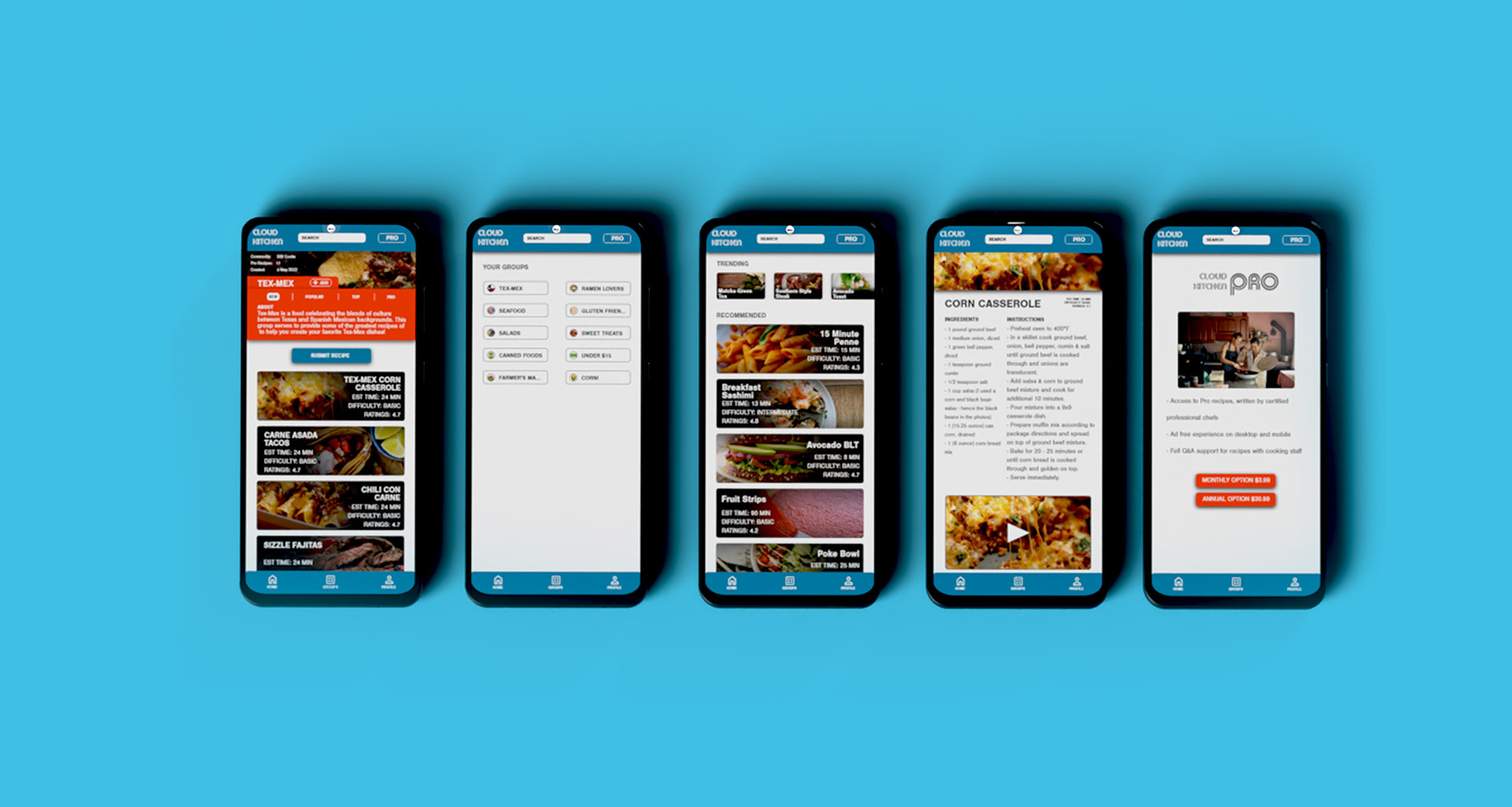
Interactive Figma Prototypes
Future steps
Working prototype has been completed. As long as usability is in the green with testers, more pages and a more expansive flow of content can be developed and rolled out for this app design.
Contact Info
evan.moushon777@gmail.com