

Project
Let's vote is a website and mobile app dedicated to helping first generation immigrants in the US register to vote.
My Role
UI/UX Designer
Built In
Figma
Project Time
4 Weeks
Responsibilities
Competitive Analysis, User Research, UI Design, Usability Studies, UX Design, Sitemap
Define
The Problem
How can we assist first-generation immigrants in the voter registration process?
The Goal
Design a website and application that helps connect first-generation immigrants with all of the resources and information needed to register to vote.
Background
Being a citizen in The United States does not grant you the immediate tools to vote. In order to vote, you must register with the government. This can be a daunting process for those new to the country, but we wanted to make a site that can help guide people directly to the needed resources. Additionally, we wanted to make a resource that can give a good crash course on the US election structures and processes.
Research & empathize
Competitive Analysis
Competitive analysis was performed on three other websites. USA.gov, Rock The Vote, and Vote.org were used as the benchmark measures for strengths and weaknesses. Competitor websites were visited and then clicked through to see what the voter information and process pages were like.

User Research
User research was conducted on in real life individuals that are all foreign-born US citizens. Users were given prototypes of the site to conduct usability studies on. Initial Q&A session was used in order to get a clear picture of what users valued in this type of website. After mockups were created, usability studies were implemented. Usability studies were unmoderated, and users were given questions and a comment section to provide feedback on their experience.
User Insights
• Users valued simplicity. They did not want a complicated or flashy architecture.
• Users often felt frustration in finding different language options. If they aren't fluent in English, the process was even more jarring.
• Despite knowing that they had to register, users stated that they had wished they had more information given to them on the US election process prior to voting.
User journey
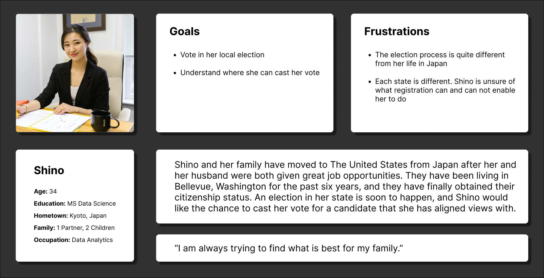
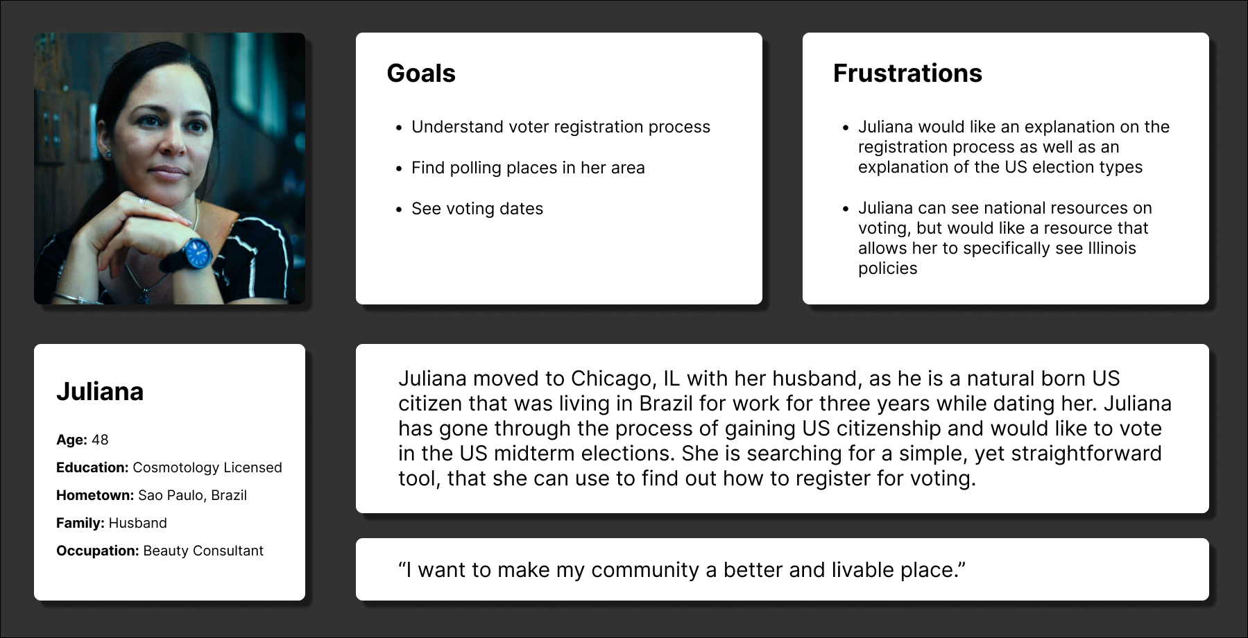
Personas
User Flow Grid
This is an illustration on the navigation and site mapping for the website. The main philosophy behind this was to help users get to their objective as easily and quickly as possible from the home screen.

DESIGN
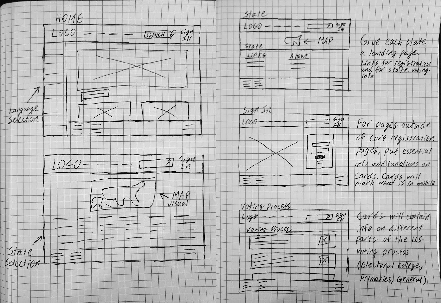
Paper Wireframes
The wireframes were sketched out on grid paper before moving to the digital phase. In this picture, you can see some of the early concepts that made the cut for the final site. Additionally, you can see notes I made along the way to help flesh out some of my thought process and philosophies behind why I designed certain things the way I did.
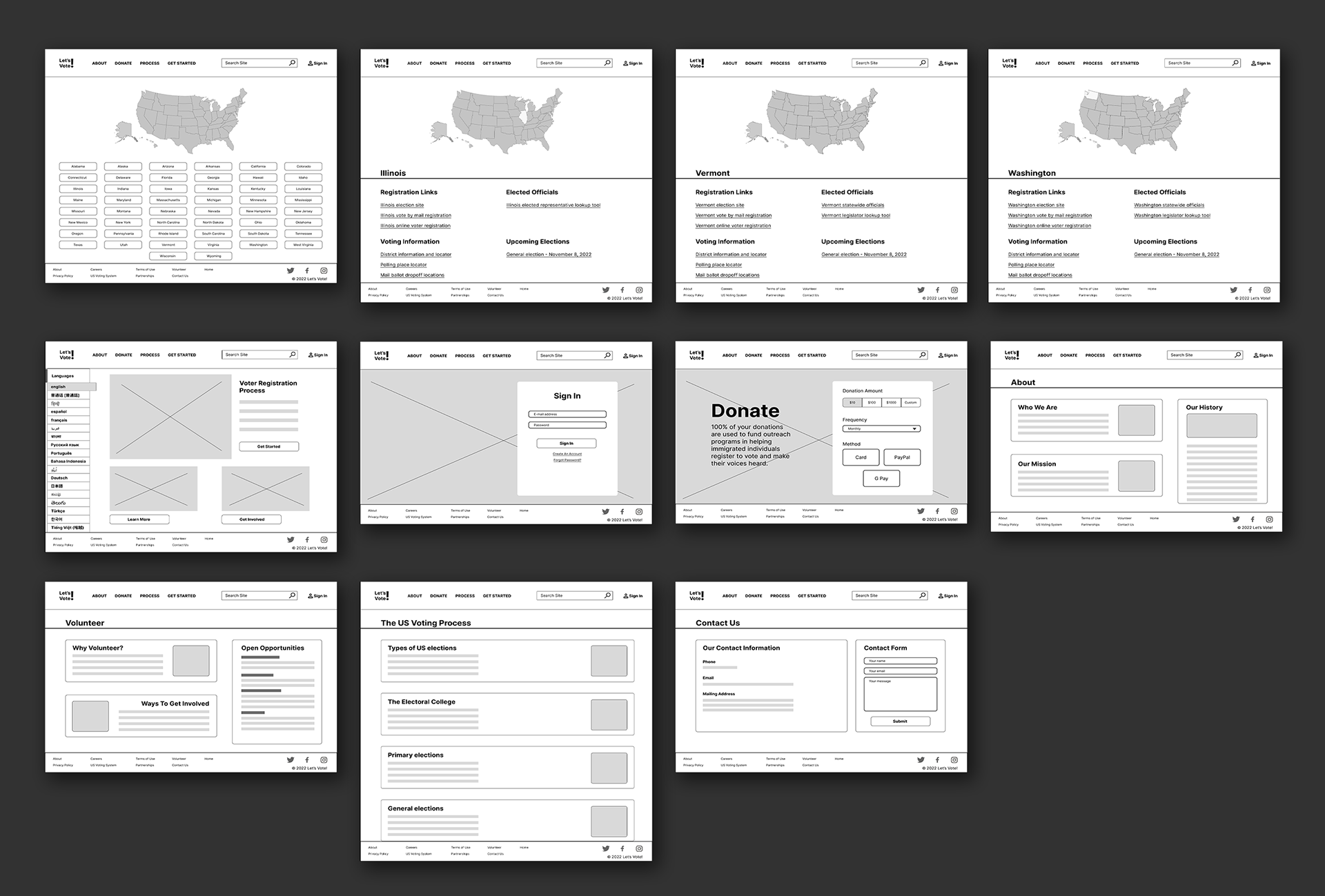
Low Fidelity Design & Prototyping
Low fidelity design was based heavily on the paper wireframes, following a philosophy of trying to maintain simplistic design and navigation while also being able to keep the mobile app in mind.
One example of keeping the mobile app in mind was making note of things that would need to be in the mobile app by encapsulating it in a card. This would help the early design layout the content in a way that could be easily transferred to a mobile screen.
High Fidelity Design & Prototyping
High fidelity design brought the envisioned concepts from the wireframes and low fidelity mockups to life. Once these pages were created, usability studies were sent out to participants to determine needed changes.

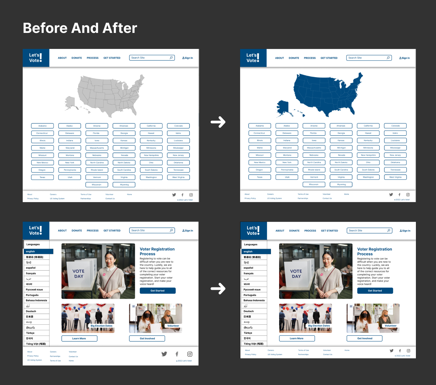
High Fidelity Usability Study & Changes
Usability studies had instructed users to navigate through the voter registration information and note any pain points or shortcomings they came across.
1. The footer was increased between lofi and hifi prototypes. Users had noted dissatisfaction with this and much preferred the slimmer and smaller footer design.
2. The original map color was grey and unclickable. Users had requested that the map be more consistent with the site's blue color and interactable.
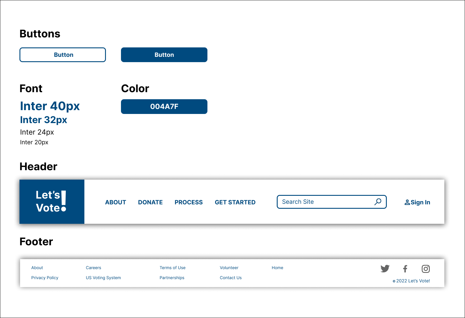
Style Guide
The style guide was put together in order to keep consistent colors and fonts. Complete with copy and paste capable icons, UI components, and color codes.
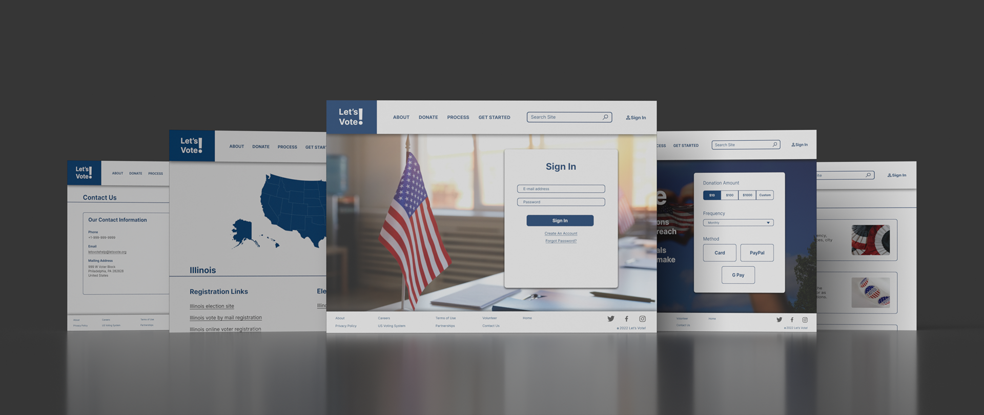
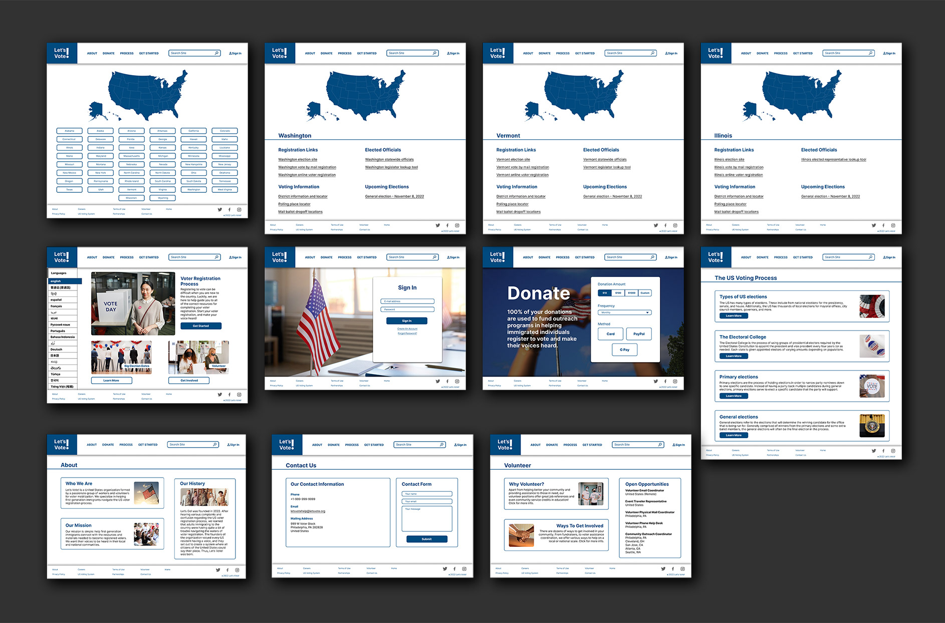
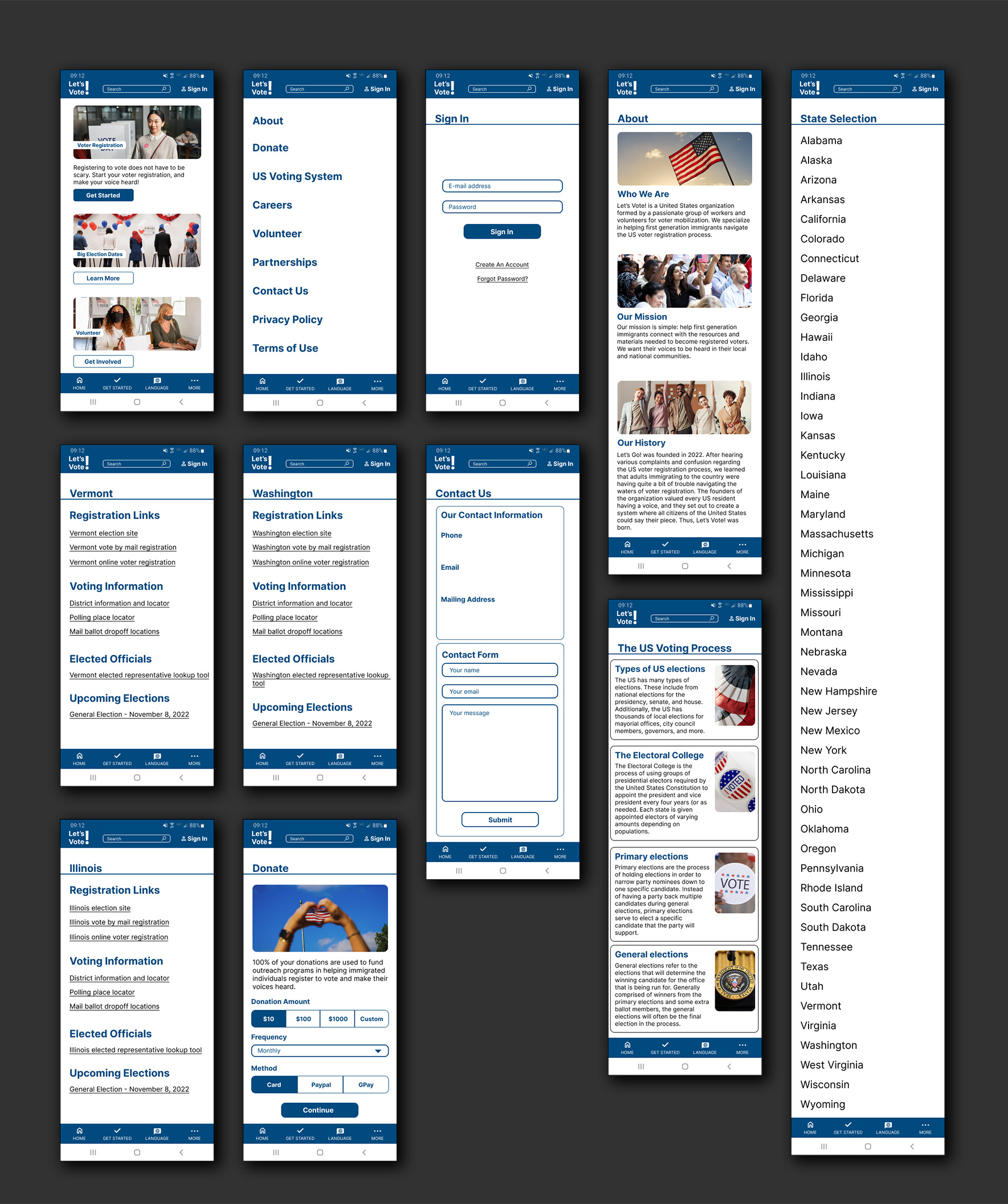
Final High Fidelity Screens
Interactive Figma Prototypes
Future steps
The app and website will be periodically visited to ensure that standards are up to modern day practices. Further usability studies can be used to refine features and make changes to creative directions to help enhance the user experience.
Contact Info
evan.moushon777@gmail.com