
Project
Clara's Bakery is a mobile ordering application. The app focuses on cart building, finding deals, and helping increase the convenience in the user's day-to-day. This application was designed as a project for the Google UX Design Certificate
My Role
UI/UX Designer
Built In
Figma
Project Time
4 Weeks
Responsibilities
Competitive Analysis, User Research, UI Design, Usability Studies, UX Design, Sitemap
Define
The Problem
How can we create an application that makes the ordering process less painful for customers?
The Goal
Design an application that would allow customers to place their orders ahead of time from any place.
Background
Customers needed a mobile solution to ordering from Clara's Bakery. Without the application, they were restricted to the time and place that they could place an order. Customers would also be subjected to long lines and food prep waiting times in the store.
Research & empathize
Competitive Analysis
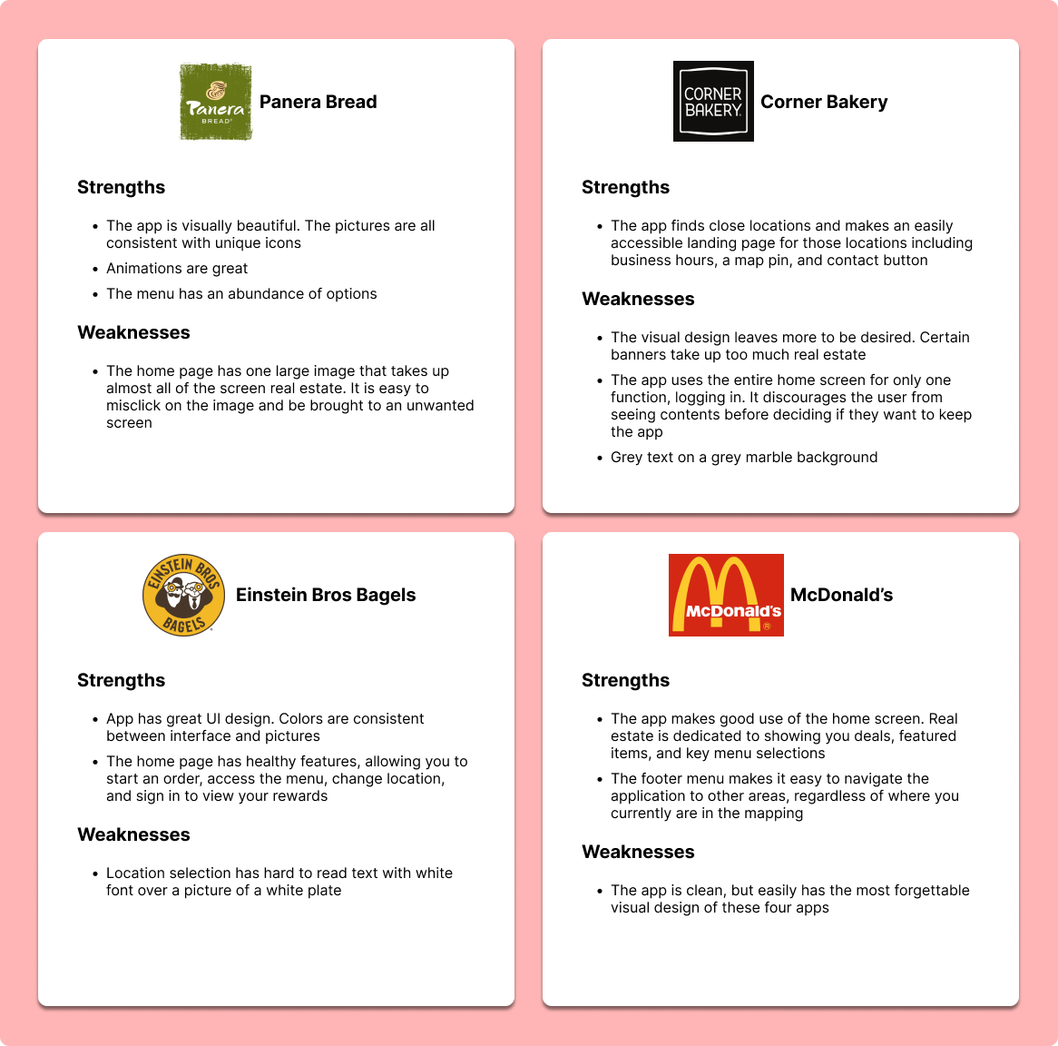
Competitive analysis was performed on three other applications. Panera, Corner Bakery, and Einstein Bros Bagels were used as primary competitor applications, and McDonald's was used as a general competitor application.
Competitor apps were downloaded, and the process of ordering took into account some of the UI and UX choices that those competitors had made. Furthermore, those choices were then sorted into strengths and weaknesses for those applications to help shape some of the design choices used for Clara's Bakery.
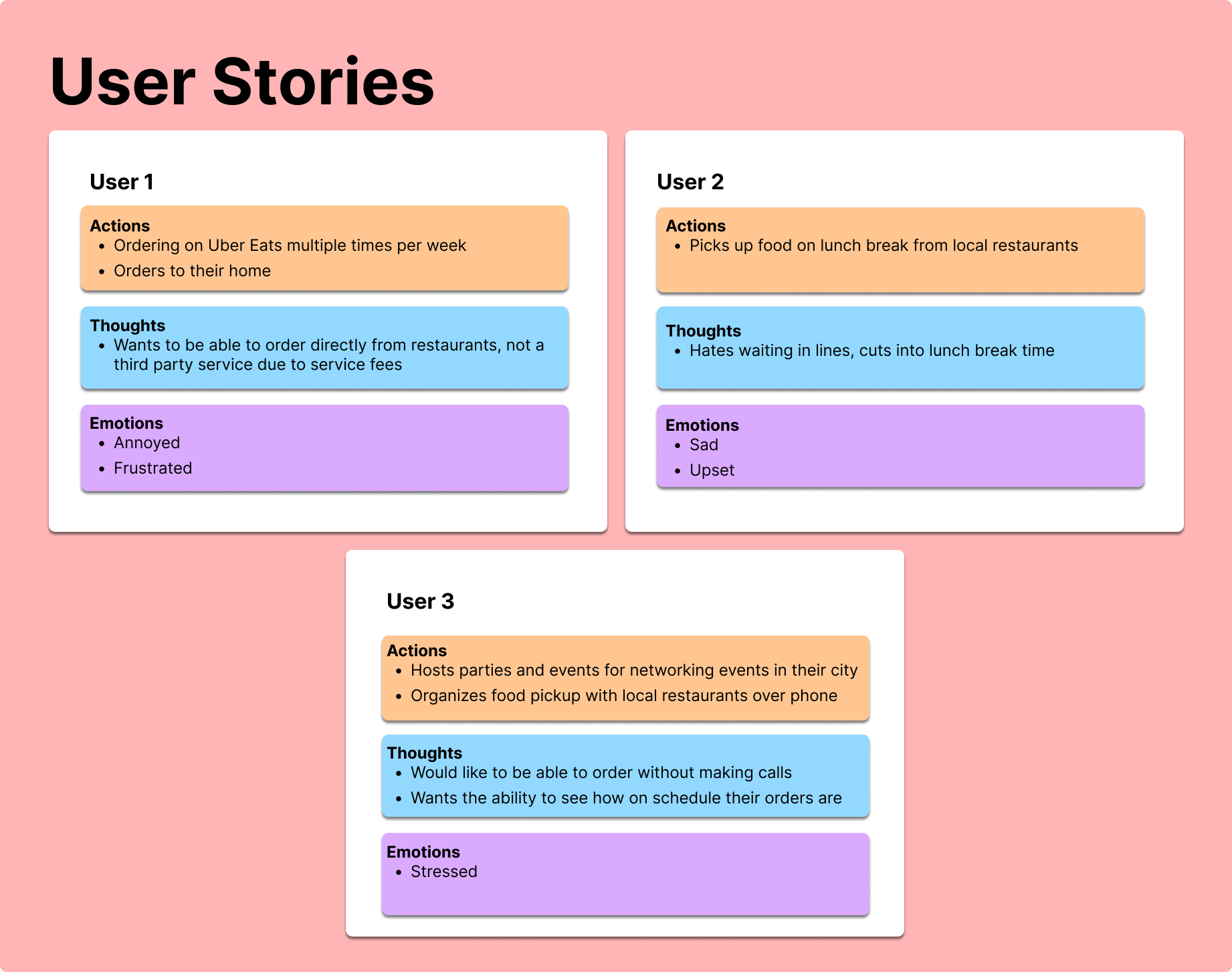
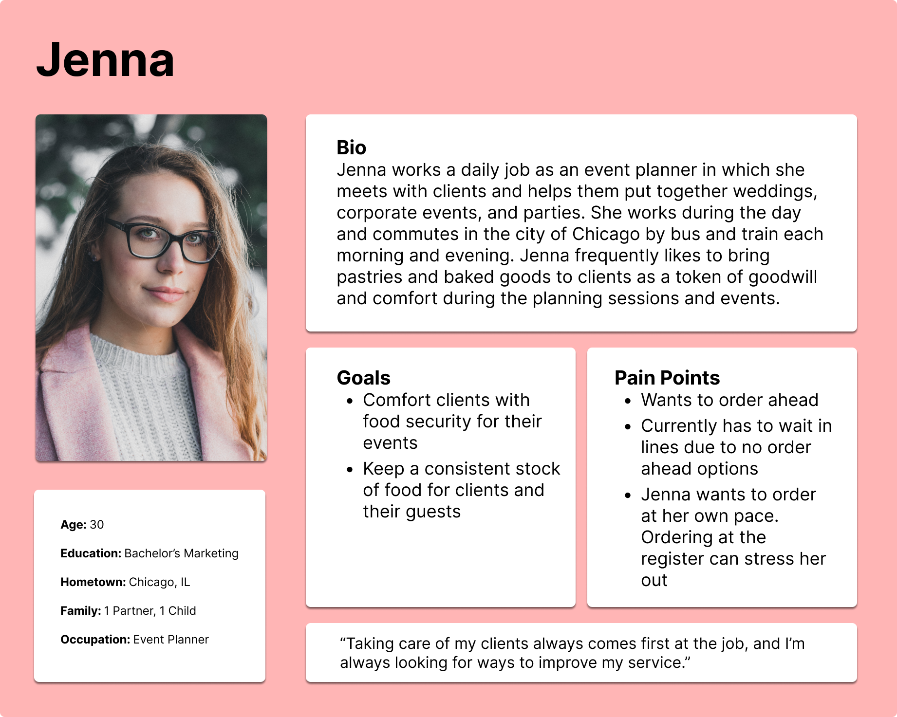
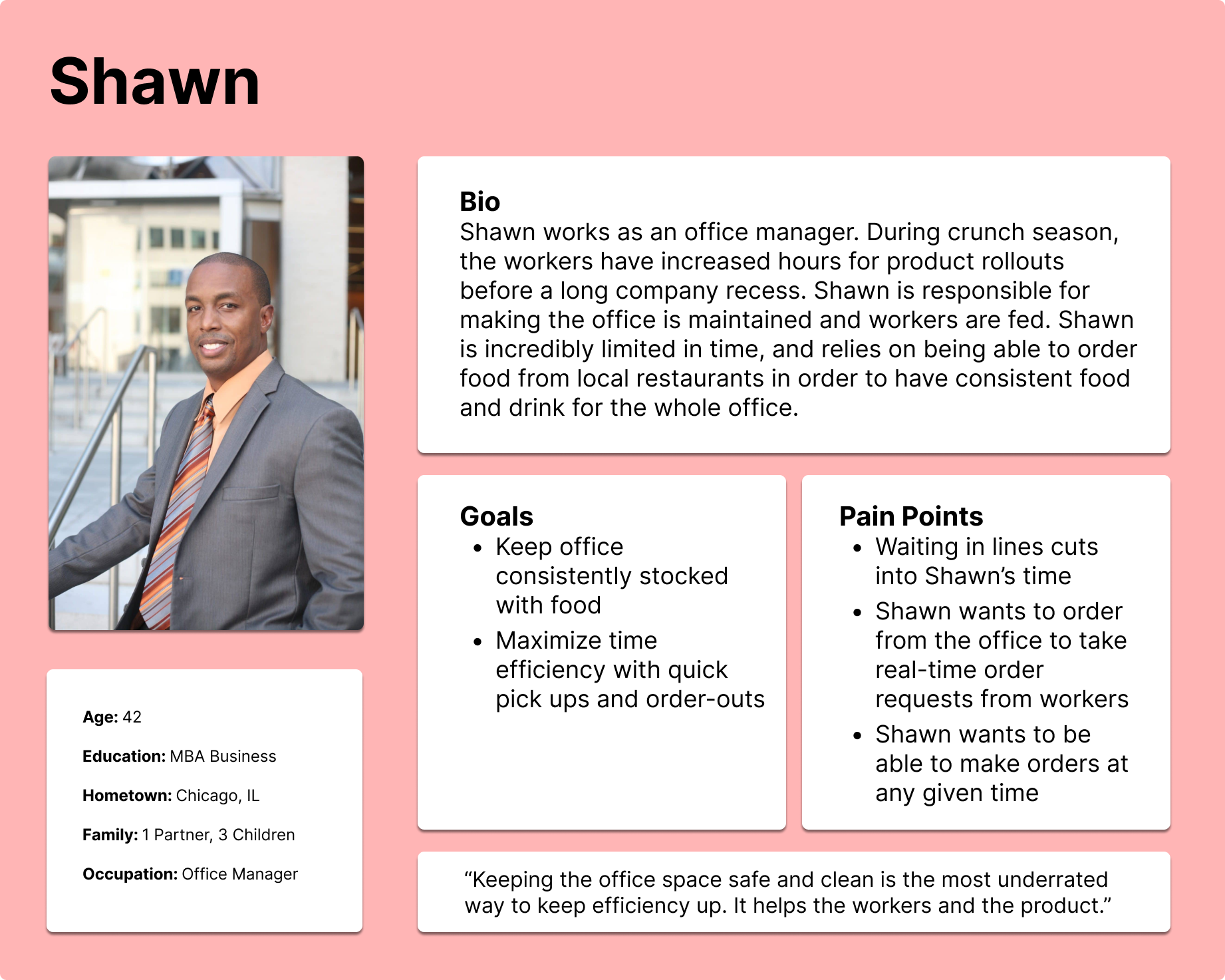
User Research
User research included participants who have had past experience ordering food on mobile apps. Participants were first interviewed on their actions, thoughts, and feelings on the current state of mobile orders. After the app had made it to prototyping stages, users were then given the chance to test the user flow and give feedback in an unmoderated usability study.
User Insights
• Users value being able to save time on waiting in line
• Users value being able to order at their own pace
• Users want to have autonomy over where they order their food
User journey
Personas
User Flow Grid
The user flow chart below serves to highlight some of the paths that a user might take in a typical use of the app. This includes the pathing to navigate to their profile options as well as filling their cart and ordering.

DESIGN
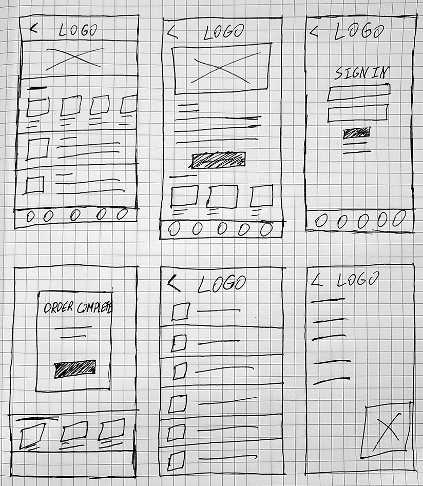
Paper Wireframes
Early designs of the application were drawn up with paper and pen. While some features were added or altered in the final design, the paper wireframes allowed the application to have multiple rapid designs mocked up.
Low Fidelity Design & Prototyping
Once some wireframes were drawn out on paper, the process of transferring them to digital began. Lofi mockups allowed a more in-depth and clear look at what the app's layout would end up looking like for a final product before creative UI and photos were populated.
Low Fidelity Usability Testing
Upon finishing the low fidelity panels, actions were created in Figma to make the application interactable for shared users. Users were given the task of selecting an item from the home page and running through the checkout process.
Usability Test Findings
1. Users felt that an option to review more in-depth order details would have been preferable on the Order Complete screen
2. Users found the implementation of two menus too confusing. Users strongly preferred the bottom menu, and thought the use of a deck menu was unnecessary
High Fidelity Design & Prototyping
Once some wireframes were drawn out on paper, the process of transferring them to digital began. Lofi mockups allowed a more in-depth and clear look at what the app's layout would end up looking like for a final product before creative UI and photos were populated.
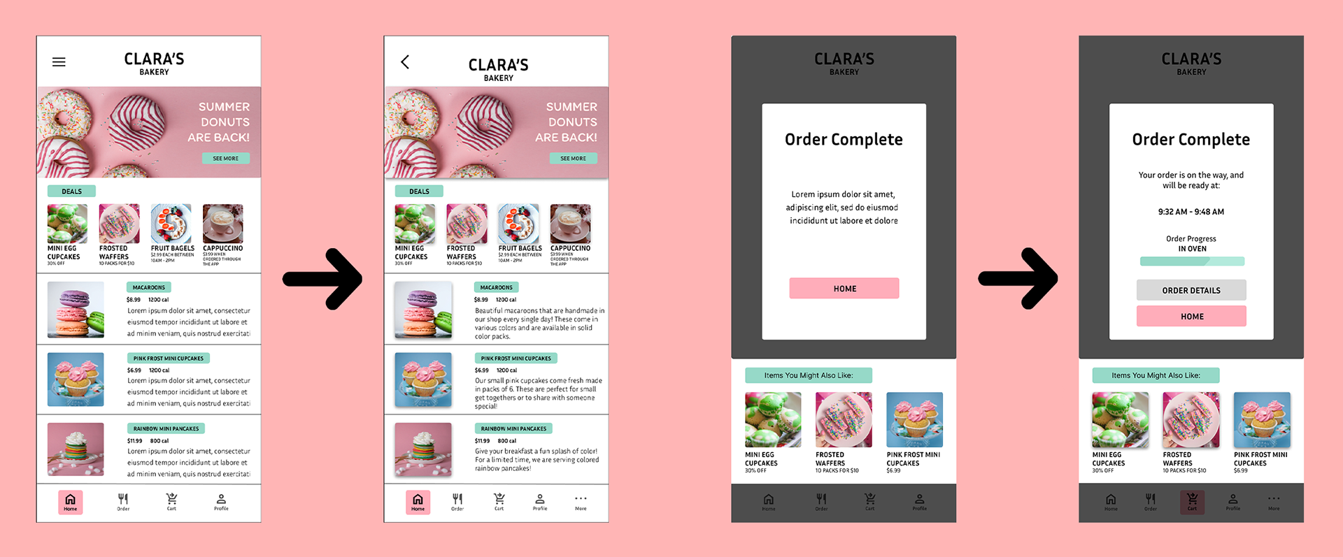
High Fidelity Usability Changes
The application had good user feedback on a second loop, and some details were changed in the high fidelity stage to enhance the user experience.
This included a back button replacing the menu, a more robust footer menu, logo adjustment for notches, and a more in depth Order Complete page.

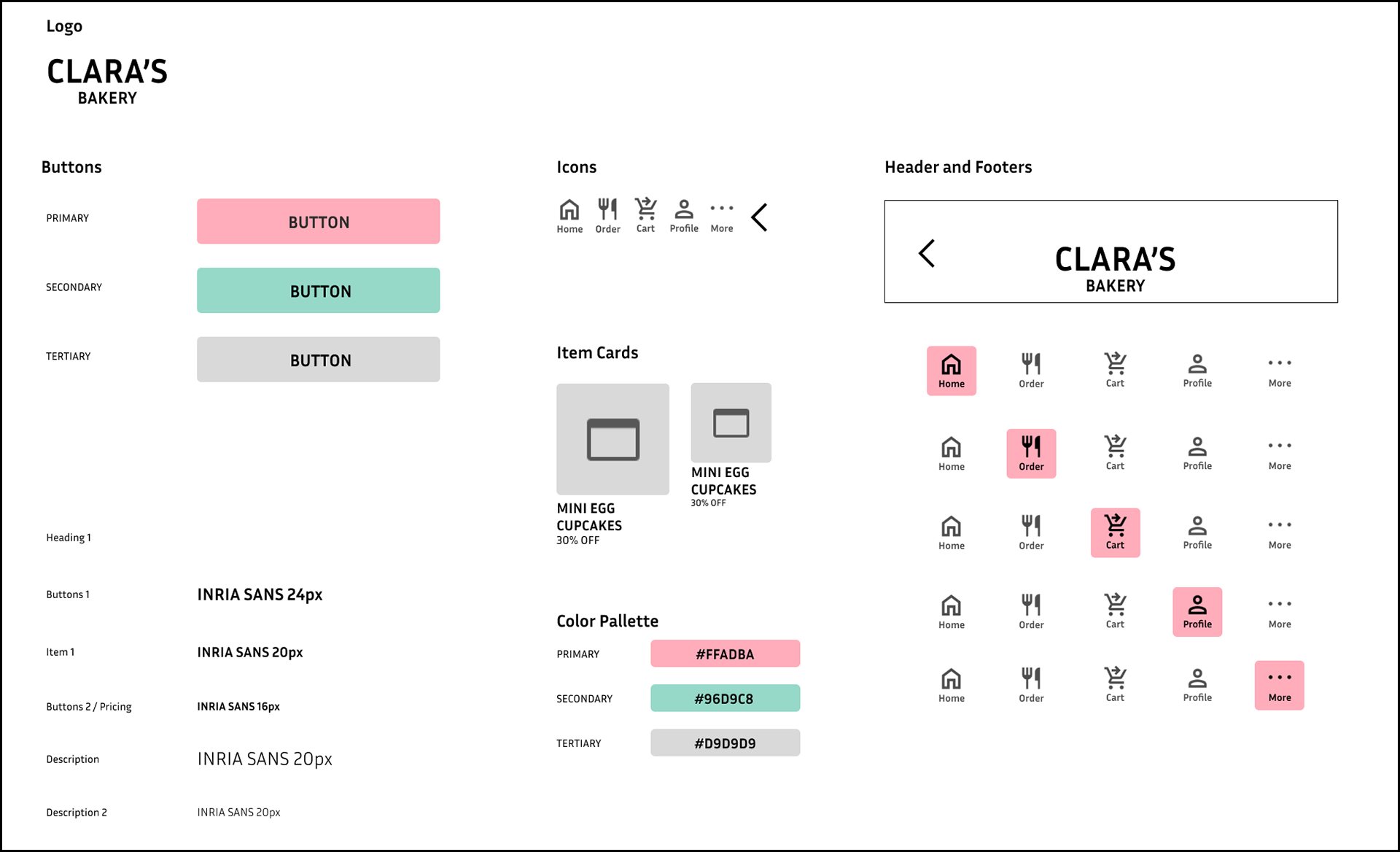
Style Guide
The style guide was put together in order to keep consistent colors and fonts. Complete with copy and paste capable icons, UI components, and color codes.
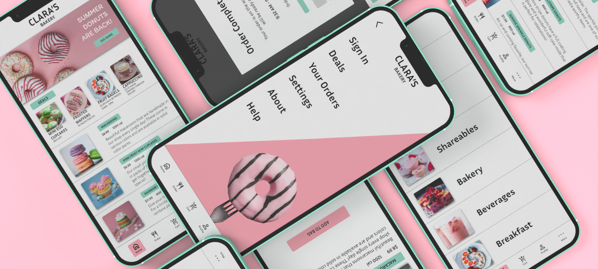
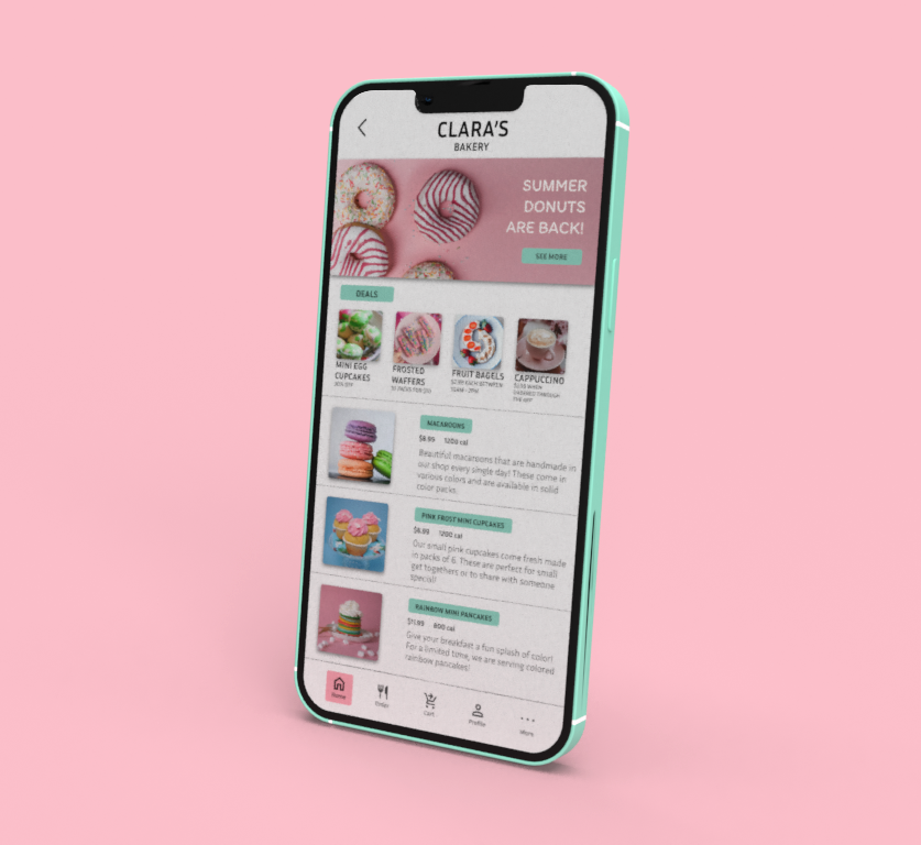
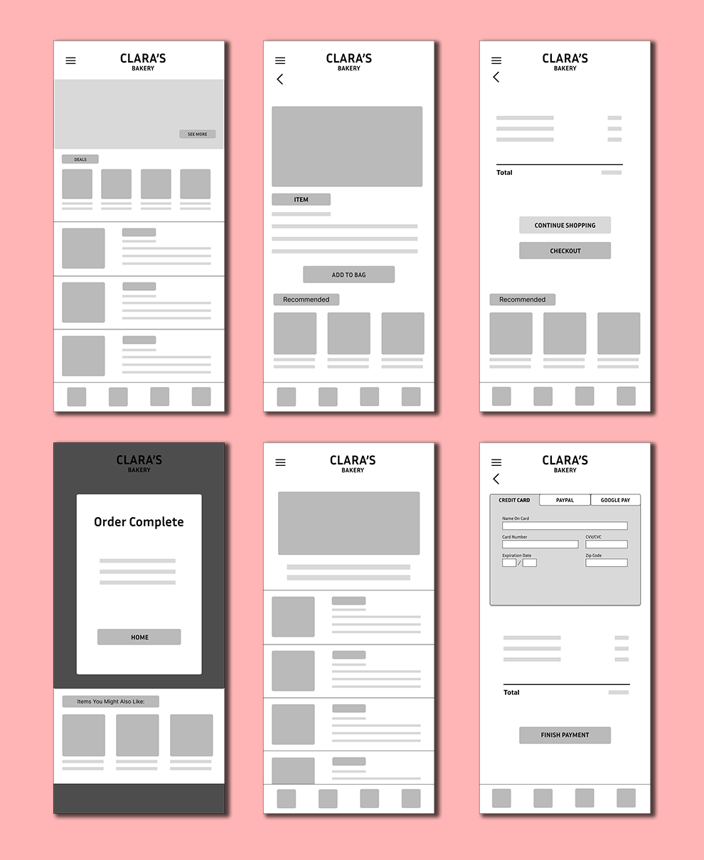
Final High Fidelity Screens
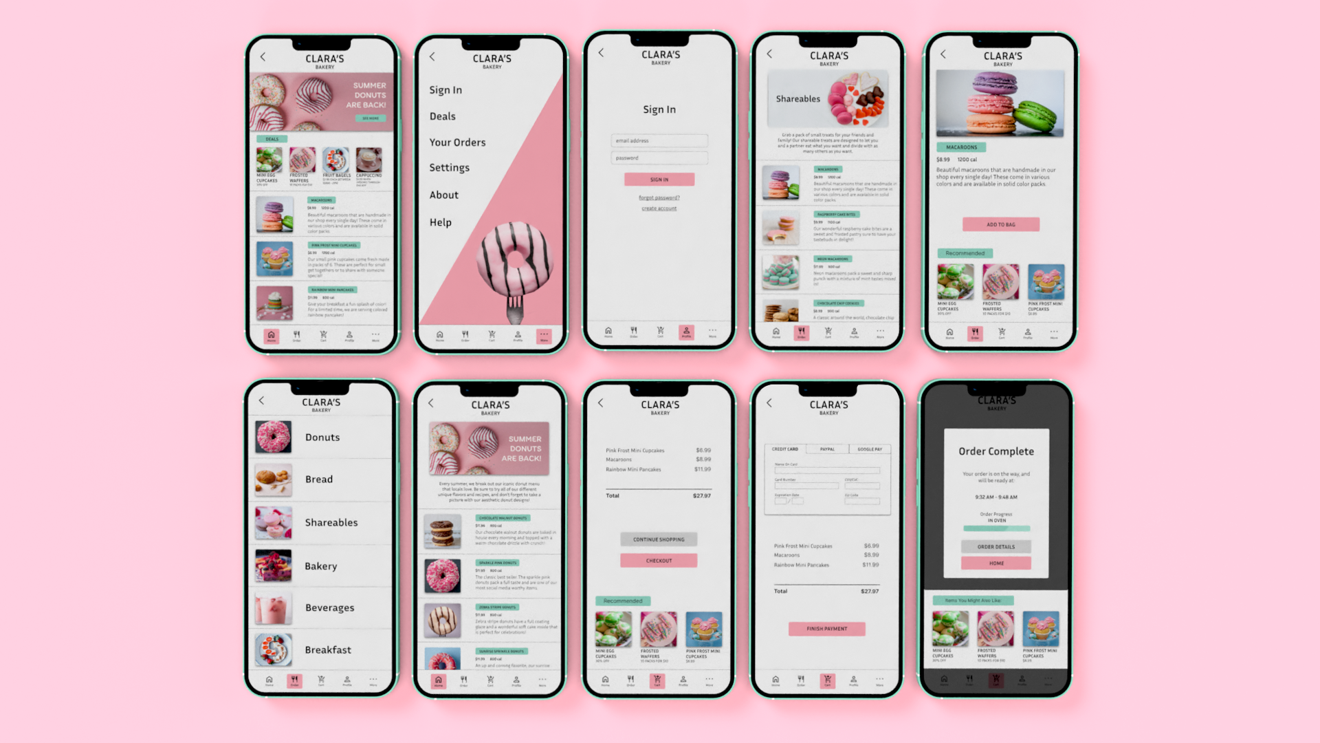
Interactive Figma Prototype
Future steps
Continue working on the application to tune up features and make sure that smooth functioning remains. More usability testing is a great planned future for the app to keep it fully competitive.
Contact Info
email: evan.moushon777@gmail.com